Archive for EDTECH506
November 26, 2012 at 7:54 AM · Filed under 1.1 Instructional Systems Design, 1.2 Message Design, 1.3 Instructional Strategies, 2.3 Computer-Based Technologies, EDTECH506
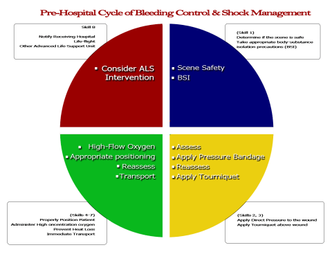
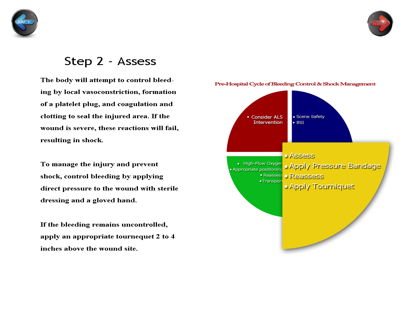
The activity for white space clarified my vision of the course appearance. This portion of the assignment solidifies the main tenets of the activities, so I decided that keeping it simple and clean reinforces what my students are learning in the course’s printed materials and face to face skills practice. I allowed a generous amount of white space around the text to help the readers access the more “personally relevant” information (p. 274), and I placed the navigation buttons on opposing sides of the page to create a symmetrical appearance and help to balance the page (p. 275). Initially, I kept the circle that I had developed previously intact. My reviewer daughter suggested that I somehow emphasize the step I am on in the diagram, so I enlarged the yellow quadrant and agreed with her opinion. I will keep her change. I might also change the “Step 2 – Assessment” position to the center to further balance the white space.
Before:
 Click here for full size
After:
 Click here for full size
Permalink
November 26, 2012 at 7:50 AM · Filed under 1.1 Instructional Systems Design, 2.3 Computer-Based Technologies, EDTECH506
After reading about the relationships between organization and learning, a looked over print and web learning material for both good and poor examples of Lohr’s principle of organization. The thought process behind developing a learning site surprised me. I realized that in fact, most of the process goes on in the head and on the design pad. This chart represents the Fick Principle or the metabolism of oxygen, and provides a clear understanding of the interaction between what we term as the ABCs – Airway, Breathing, and Circulation. We need oxygen to live at the most basic cellular level. Oxygen is our primary fuel, and our bloodstream is the transport for that fuel to become metabolized. I chose the shapes because they represent molecules of oxygen or carbon dioxide. The red arrows symbolize the blood stream that transports the oxygen. I used a circular model to emphasize the circulatory nature of the cycle with the inhalation situated at the top and moving in a clockwise pattern as common to western culture and the thick arrows suggest a strong relationship between each action (p 128) – if any part of this chain is broken, the cycle becomes incomplete and the human body systems begin an attempt to compensate for the loss. This compensation is known as “shock.” I placed the beginning of the cycle at the top-most position, knowing that my learners are used to a left-right reading order (p. 135). But I will change it to add a slightly larger circle to more clearly define where to begin the cycle.

Lohr, L. (2008). Creating graphics for learning and performance: lessons in visual literacy (2 ed.). Upper Saddle River, NJ: Merrill. Retrieved 2012
Permalink
November 26, 2012 at 7:44 AM · Filed under 1.1 Instructional Systems Design, 1.2 Message Design, 1.3 Instructional Strategies, 2.3 Computer-Based Technologies, 2.4 Integrated Technologies, EDTECH506
 My adult learners are often fatigued when they come to my evening classes. Despite thier lack of energy, I need for them to be alert. To provide an energy boost and give them some mental stimulus, I choose to use patriotic red, white, and blue color scheme (p. 265). Not only does each color stimulate their senses, each color represents an aspect of pre-hospital care that few see. Red represents blood, blue represents courage, and white represents cleanliness or purity. I chose hues with contrasting values – the bright (high intensity) red and the deeper (lower intensity) blue. My assignment is a cardiac label that will be used to indicate blood flow, identify electrical impulse areas, and identify structures of the heart. For a representation of reality (p.254), I chose to use blue font to represent the unoxygenated blood returning from the peripheral systems. I then chose to use red to indicate oxygenated blood flow.
Lohr, L. (2008). Creating graphics for learning and performance: lessons in visual literacy (2 ed.). Upper Saddle River, NJ: Merrill. Retrieved 2012
Permalink
November 26, 2012 at 7:13 AM · Filed under 1.2 Message Design, 1.4 Learner Characteristics, 2.3 Computer-Based Technologies, 3.1 Media Utilization, 4.3 Delivery System Management, 4.4 Information Management, EDTECH506
There are many factors to providing critical prehospital care. EMTs have to know how to determine if a patient is in immediate need of advanced care. The students taking this course will refer to this condensed chart which follows Lohr’s three C’s. There is a lot to remember in this section, so I concentrated a lot of information in one spot. In doing so, I also designed it to be concise and concrete with the white text dominating the field. I initially had the blue text fields extending out to the edge of the page, but decided to increase the white ground a bit to balance the high contrast of the blue and red after my reviewer complained that it “hurt his eyes.” I decided the problem was one in which the figure and ground competed (p. 102). When I reduced the width of the blue, I found that the text was enhanced by the white space around the blue text box.
I analyzed the figure to see if I had unintentionally created a visual conflict. Originally, I had. The blue textboxes made the graphic look like a US Navy add with the blue and white “stripes” creating a 1+1=3 phenomenon (p. 100). My reviewer’s complaint told me that the figure and ground were causing visual conflict. The revision is much better – allowing the learner to “focus easily and quickly on [the] key message.” (p. 105).
Overall, I am pleased with this part of my project. I used the same colors as prior projects to begin developing a color theme of red, white, and blue to match that of our ambulance service. It will work because it is easy to read and put into a logical format. These are not cardinal elements, so leaving them unnumbered helps to reduce the tendency to rank the elements.

References
Lohr, L. (2008). Creating graphics for learning and performance: Lessons in visual literacy. (Second.) Upper Saddle River, NJ: Pearson Education, Inc.
Permalink
November 11, 2012 at 2:11 PM · Filed under 1.1 Instructional Systems Design, 1.2 Message Design, 1.3 Instructional Strategies, 2.1 Print Technologies, 2.2 Audiovisual Technologies, 2.3 Computer-Based Technologies, 2.4 Integrated Technologies, 3.1 Media Utilization, 5.1 Problem Analysis, EDTECH506
There are many factors to providing critical prehospital care. EMTs must gain the skills necessary to quickly determine if a patient is in immediate need of advanced care. I wanted the design of the critical care page to be comprehensive, yet clean. As students enter their practical skills, they need to easily remember the information presented. There is a lot to remember in this section, so the design demands that a lot of information is concentrated in each section. I enhanced the text with contrasting colors for cohesiveness, but the sheer volume of text still needed something more to make the steps more concrete. Because a picture is worth a thousand words, I am seeking representative images to further solidify the different steps.
References
Lohr, L. (2008). Creating graphics for learning and performance: Lessons in visual literacy. (Second.) Upper Saddle River, NJ: Pearson Education, Inc.

There is a lot to remember in this section, so I concentrated a lot of information in one spot. In doing so, I also designed it to be concise and concrete with the white text dominating the field. The generous white space offsets the high contrast of the blue and red.
Permalink
October 22, 2012 at 12:44 AM · Filed under 1.3 Instructional Strategies, 2.1 Print Technologies, 2.3 Computer-Based Technologies, 2.4 Integrated Technologies, 3.1 Media Utilization, EDTECH506
CARP design elements are used to better communicate a lesson or message through visual representation. Contrast. Alignment. Repetition. Proximity. Each of these elements impacts learning, and a good design will improve the course content. I chose grey-scale for my design, planning a contrast punch with black and white text and graphics. I chose the organized feel of rectangle shapes and symmetrical rows and columns they create, while using repetition to lighten the tense lines in the image. Each row a different color, but the proximity of clone like text boxes reveals the concepts therein are connected. In the end, I’m pleased with that decision feeling like I have met the first course goal – “to apply principles of visual literacy o the design of instructional messages.”
Permalink
October 8, 2012 at 7:57 PM · Filed under 1.1 Instructional Systems Design, 1.2 Message Design, 1.3 Instructional Strategies, 1.4 Learner Characteristics, 2.3 Computer-Based Technologies, 2.4 Integrated Technologies, 3.1 Media Utilization, 5.1 Problem Analysis, EDTECH506, Standard 1: Design, Standard 2: Development

Unit 3 – Bleeding Control and Shock Management
One of the first lessons I learned in elementary school was the use of shapes in art. Like many of my classmates, I happily drew triangles, circles, squares, and rectangles intermingled with lines of all lengths and thicknesses to represent happy families, houses, flowers, trees, and the bright shining sun. As time passed, I used ovals and more lines to practice the alphabet and numbers 0-9.
Shapes and lines continue to play an important part in my hobbies of photography and drawing. My eyes seek out and find shapes and patterns everywhere I look. This chapter has been by far a favorite as I gain new insight to some of the visual characteristics of shapes and how they communicate unity, emotions, or organization. I was intrigued by the examples Lohr sets forth in Figures 10-2 through 10-6 (pp. 251-255) and noted that I am usually drawn to those layouts that depict unity and those that separate and define. Therefore it was no surprise that I chose to use those elements in my own layout for my unit. I chose to use simple rectangles to organize the information on a standard computer display. Other units can be quickly accessed on the lower ribbon links. I like the way rectangles highlight and organize the information with clean lines. My use of color parallels the colors we use on our local EMS logo and ambulance. When my daughter pointed out that my page looked a little bit “cluttered” I added the broken circle in an attempt to unify the page elements and a solid line of a different color to separate and define the other units. I am pleased with the results, but knowing my penchant for revision, left the layers intact for future editing.
Permalink
September 30, 2012 at 9:33 PM · Filed under 1.1 Instructional Systems Design, 1.2 Message Design, 1.4 Learner Characteristics, 2.1 Print Technologies, 2.2 Audiovisual Technologies, 3.1 Media Utilization, EDTECH506
Visual representation plays a vital role in my life. I remember putting on my first set of glasses and realizing for the first time what a difference detail makes in our world view. That impression gave way to a lifelong study of detail that impacts every aspect of my life. The past weeks in this course are no exception as I considered what is universal design, what would be a useful unit of instruction, and how might I best represent myself through visual clues. After submitting the project plan, I nearly changed topics when reading the typography assignment. How might I create what I might consider illustrated text that conveys meaning. I was surprised to find that the exercise, though challenging, was a pleasant task.

Vital words for bleeding control and shock management unit of instruction.
When referring to Mayer’s (2001) research, Lohr emphasizes that “visuals be designed so that they support cognitive processes of selection, organization, and integration” to maximize learning (2008 p.63). Using that formula, I hope to create a unit of instruction that will be easily remembered, and easily implemented when conditions call for it. After all, “a picture is worth a thousand words.”
Reference
Lohr, L. (2008). Creating graphics for learning and performance: lessons in visual literacy (2 ed.). Upper Saddle River, NJ: Merrill. Retrieved 2012
Permalink


