This app design has been an intriguing challenge that fits right in to my life of predicaments and situations. I switched smart phone platforms for this course and have struggled with something akin to regret these past few months. An accomplished iOS user, I feel clumsy and frustrated with the Android, but I persist in my overcoming this obstacle. Last week I determined to get my apps organized into folders. I was successful, but in doing so, I inadvertently changed some setting within my Android that has prevented me from connecting (blocks editor does not see my phone).
I plan for my app to be used by EMT’s on the ambulance or on scene. They will enter patient information that can be sent via SMS to our local ER prior to our arrival. We have to be cautious about providing a patient’s name over our radio communications, but there are several “hot spots” during our transport that an SMS message can be sent prior to our arrival (we have a minimum 45 minute transport). I designed the app so that the user will interact via text box entries, check boxes, gps positioning. and SMS messaging. The environment has varied lighting, so I avoided the use of color, choosing a neutral dark gray and white for the primary screens.
I like being able to drag and drop functions in the Component Designer. It gives me an opportunity to play with the layout. The file size constraint is a potential setback. I am worried that as my app continues to grow, the size might get too big, so I have been resizing the photos in Photoshop to stay within the 5MB limit. I have frequent problems launching the blocks editor and am wondering why at this late date it is beginning to give me problems.
Archive for 1.2 Message Design
EDTECH 597 – The Component Designer
November 27, 2012 at 11:24 PM · Filed under 1.1 Instructional Systems Design, 1.2 Message Design, 2.3 Computer-Based Technologies, 2.4 Integrated Technologies, 3.1 Media Utilization, 4.1 Project Management, 5.1 Problem Analysis, EDTECH597
EDTECH 506: White Space
November 26, 2012 at 7:54 AM · Filed under 1.1 Instructional Systems Design, 1.2 Message Design, 1.3 Instructional Strategies, 2.3 Computer-Based Technologies, EDTECH506
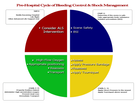
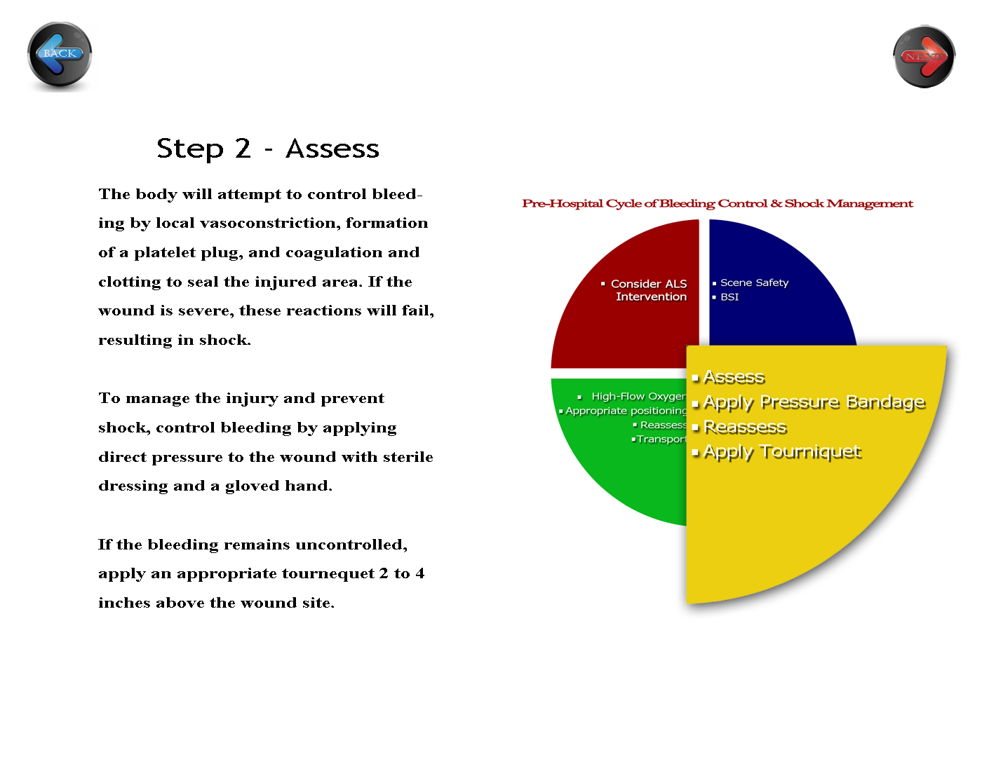
The activity for white space clarified my vision of the course appearance. This portion of the assignment solidifies the main tenets of the activities, so I decided that keeping it simple and clean reinforces what my students are learning in the course’s printed materials and face to face skills practice. I allowed a generous amount of white space around the text to help the readers access the more “personally relevant” information (p. 274), and I placed the navigation buttons on opposing sides of the page to create a symmetrical appearance and help to balance the page (p. 275). Initially, I kept the circle that I had developed previously intact. My reviewer daughter suggested that I somehow emphasize the step I am on in the diagram, so I enlarged the yellow quadrant and agreed with her opinion. I will keep her change. I might also change the “Step 2 – Assessment” position to the center to further balance the white space.
Before:
 Click here for full size
After:
 Click here for full size
EDTECH506: Picture This
November 26, 2012 at 7:44 AM · Filed under 1.1 Instructional Systems Design, 1.2 Message Design, 1.3 Instructional Strategies, 2.3 Computer-Based Technologies, 2.4 Integrated Technologies, EDTECH506
 My adult learners are often fatigued when they come to my evening classes. Despite thier lack of energy, I need for them to be alert. To provide an energy boost and give them some mental stimulus, I choose to use patriotic red, white, and blue color scheme (p. 265). Not only does each color stimulate their senses, each color represents an aspect of pre-hospital care that few see. Red represents blood, blue represents courage, and white represents cleanliness or purity. I chose hues with contrasting values – the bright (high intensity) red and the deeper (lower intensity) blue. My assignment is a cardiac label that will be used to indicate blood flow, identify electrical impulse areas, and identify structures of the heart. For a representation of reality (p.254), I chose to use blue font to represent the unoxygenated blood returning from the peripheral systems. I then chose to use red to indicate oxygenated blood flow.
Lohr, L. (2008). Creating graphics for learning and performance: lessons in visual literacy (2 ed.). Upper Saddle River, NJ: Merrill. Retrieved 2012
EDTECH506: Concrete and Concise
November 26, 2012 at 7:13 AM · Filed under 1.2 Message Design, 1.4 Learner Characteristics, 2.3 Computer-Based Technologies, 3.1 Media Utilization, 4.3 Delivery System Management, 4.4 Information Management, EDTECH506
There are many factors to providing critical prehospital care. EMTs have to know how to determine if a patient is in immediate need of advanced care. The students taking this course will refer to this condensed chart which follows Lohr’s three C’s. There is a lot to remember in this section, so I concentrated a lot of information in one spot. In doing so, I also designed it to be concise and concrete with the white text dominating the field. I initially had the blue text fields extending out to the edge of the page, but decided to increase the white ground a bit to balance the high contrast of the blue and red after my reviewer complained that it “hurt his eyes.” I decided the problem was one in which the figure and ground competed (p. 102). When I reduced the width of the blue, I found that the text was enhanced by the white space around the blue text box.
I analyzed the figure to see if I had unintentionally created a visual conflict. Originally, I had. The blue textboxes made the graphic look like a US Navy add with the blue and white “stripes” creating a 1+1=3 phenomenon (p. 100). My reviewer’s complaint told me that the figure and ground were causing visual conflict. The revision is much better – allowing the learner to “focus easily and quickly on [the] key message.” (p. 105).
Overall, I am pleased with this part of my project. I used the same colors as prior projects to begin developing a color theme of red, white, and blue to match that of our ambulance service. It will work because it is easy to read and put into a logical format. These are not cardinal elements, so leaving them unnumbered helps to reduce the tendency to rank the elements.

References
Lohr, L. (2008). Creating graphics for learning and performance: Lessons in visual literacy. (Second.) Upper Saddle River, NJ: Pearson Education, Inc.
EDTECH 506 – Natural Selection
November 11, 2012 at 2:11 PM · Filed under 1.1 Instructional Systems Design, 1.2 Message Design, 1.3 Instructional Strategies, 2.1 Print Technologies, 2.2 Audiovisual Technologies, 2.3 Computer-Based Technologies, 2.4 Integrated Technologies, 3.1 Media Utilization, 5.1 Problem Analysis, EDTECH506
There are many factors to providing critical prehospital care. EMTs must gain the skills necessary to quickly determine if a patient is in immediate need of advanced care. I wanted the design of the critical care page to be comprehensive, yet clean. As students enter their practical skills, they need to easily remember the information presented. There is a lot to remember in this section, so the design demands that a lot of information is concentrated in each section. I enhanced the text with contrasting colors for cohesiveness, but the sheer volume of text still needed something more to make the steps more concrete. Because a picture is worth a thousand words, I am seeking representative images to further solidify the different steps.
References
Lohr, L. (2008). Creating graphics for learning and performance: Lessons in visual literacy. (Second.) Upper Saddle River, NJ: Pearson Education, Inc.

There is a lot to remember in this section, so I concentrated a lot of information in one spot. In doing so, I also designed it to be concise and concrete with the white text dominating the field. The generous white space offsets the high contrast of the blue and red.
EDTECH 597: Do Not Disturb
October 9, 2012 at 12:16 AM · Filed under 1.1 Instructional Systems Design, 1.2 Message Design, 2.2 Audiovisual Technologies, 2.3 Computer-Based Technologies, 2.4 Integrated Technologies, 5.1 Problem Analysis, EDTECH597
What a week to begin complexity! Just as I was beginning to get the hang of App inventor and spreading my wings to put out new versions of the basic apps, along comes an assignment with location generators, memory, and text-to-voice capabilities. In the midst of it all, widespread ISP server failures, two ambulance runs, and a wounded foal only added to the confusion. The tutorial seemed straightforward, but I kept encountering problems such as having to search for components the drawers. My Blocks Editor did NOT match the screens in the book because the instructions have me rename elements, but their tutorial images are not renamed. I work late at night, so had difficulties finding a second phone. My emulator kept crashing despite multiple reboots. After more than six app hours, my tutorial app worked and was ready to be saved. This experience has given me a lot of insight into developing course materials for online activities. How many times do we educators fail to provide visual or contextual clues on how to proceed when technology fails? How often do I provide my students with misaligned images and text? How do my learners approach new challenges, and what is my role in guiding them through the course? Finally, and most challenging of all, what to do for extending the app? My family members seem to have a deep-seated need to know where I am at all times…given my schedule this past week, perhaps a “Do Not Disturb” is in order.

ET597DRoid
EDTECH 506: The Shape of Things to Come
October 8, 2012 at 7:57 PM · Filed under 1.1 Instructional Systems Design, 1.2 Message Design, 1.3 Instructional Strategies, 1.4 Learner Characteristics, 2.3 Computer-Based Technologies, 2.4 Integrated Technologies, 3.1 Media Utilization, 5.1 Problem Analysis, EDTECH506, Standard 1: Design, Standard 2: Development

Unit 3 – Bleeding Control and Shock Management
One of the first lessons I learned in elementary school was the use of shapes in art. Like many of my classmates, I happily drew triangles, circles, squares, and rectangles intermingled with lines of all lengths and thicknesses to represent happy families, houses, flowers, trees, and the bright shining sun. As time passed, I used ovals and more lines to practice the alphabet and numbers 0-9.
Shapes and lines continue to play an important part in my hobbies of photography and drawing. My eyes seek out and find shapes and patterns everywhere I look. This chapter has been by far a favorite as I gain new insight to some of the visual characteristics of shapes and how they communicate unity, emotions, or organization. I was intrigued by the examples Lohr sets forth in Figures 10-2 through 10-6 (pp. 251-255) and noted that I am usually drawn to those layouts that depict unity and those that separate and define. Therefore it was no surprise that I chose to use those elements in my own layout for my unit. I chose to use simple rectangles to organize the information on a standard computer display. Other units can be quickly accessed on the lower ribbon links. I like the way rectangles highlight and organize the information with clean lines. My use of color parallels the colors we use on our local EMS logo and ambulance. When my daughter pointed out that my page looked a little bit “cluttered” I added the broken circle in an attempt to unify the page elements and a solid line of a different color to separate and define the other units. I am pleased with the results, but knowing my penchant for revision, left the layers intact for future editing.
EDTECH 506 Learning by Design
September 30, 2012 at 9:33 PM · Filed under 1.1 Instructional Systems Design, 1.2 Message Design, 1.4 Learner Characteristics, 2.1 Print Technologies, 2.2 Audiovisual Technologies, 3.1 Media Utilization, EDTECH506
Visual representation plays a vital role in my life. I remember putting on my first set of glasses and realizing for the first time what a difference detail makes in our world view. That impression gave way to a lifelong study of detail that impacts every aspect of my life. The past weeks in this course are no exception as I considered what is universal design, what would be a useful unit of instruction, and how might I best represent myself through visual clues. After submitting the project plan, I nearly changed topics when reading the typography assignment. How might I create what I might consider illustrated text that conveys meaning. I was surprised to find that the exercise, though challenging, was a pleasant task.

Vital words for bleeding control and shock management unit of instruction.
When referring to Mayer’s (2001) research, Lohr emphasizes that “visuals be designed so that they support cognitive processes of selection, organization, and integration” to maximize learning (2008 p.63). Using that formula, I hope to create a unit of instruction that will be easily remembered, and easily implemented when conditions call for it. After all, “a picture is worth a thousand words.”
Reference
Lohr, L. (2008). Creating graphics for learning and performance: lessons in visual literacy (2 ed.). Upper Saddle River, NJ: Merrill. Retrieved 2012
EDTECH 501: Plagiarism; Resist the Temptation!
October 3, 2011 at 11:51 PM · Filed under 1.2 Message Design, 2.2 Audiovisual Technologies, 2.3 Computer-Based Technologies, 3.4 Policies and Regulations, EDTECH501, Standard 2: Development, Uncategorized
Plagiarism (Latin plagiare “to kidnap”)
Plagiarism
by: brimstef
http://www.xtranormal.com/xtraplayr/12517753/plagiarism
This video (Brimacomb, 2011) covers using someone else’s work as my own (in this case “buying” a paper from a website), copy and pasting without citations, and using my own prior work without instructor permission. As these two college students talk about whether or not to go to the beach with friends, I incorporated something that I learned on this project. I was intrigued by the root (Latin “kidnap”), and found it to be useful in the script. Xtranormal is a new medium for me. I was impressed by the animation, but found the text readers somewhat difficult to understand. Nevertheless, I was excited to see how my video-graphics students became immediately engaged. I wish I could accumulate points rather than purchase them. It would make the experience more enjoyable. I used the Salmon River Joint School District Trustees’ Policy Manual (2009) as my source rather than the BSU Code of Conduct (2011), because I want to embed my video onto my high school’s home page to emphasize the three aspects of plagiarism.
REFERENCES:
Boise State University (2011). Student Conduct Program – Code of Conduct – Article 4. Retrieved October 3, 2011, from Boise State University Code of Conduct: http://osrr.boisestate.edu/scp-codeofconduct-article4/
Brimacomb, S. (2011, October 3). Plagiarism. Retrieved October 3, 2011, from XtraNormal: http://www.xtranormal.com/watch/12517753/plagiarism
Brimacomb, S. (2011, October 3). Plagiarism Video Discussion Forum. Retrieved October 4, 2011, from EDTECH Boise State EDTECH 501-4175 (FA11): http://edtech.mrooms.org/mod/forum/discuss.php?d=28525
Salmon River Joint School District Trustees. (2009, April 1). Policy 3202. Retrieved September 29, 2011, from Salmon River Joint School District 243: http://www.jsd243.org/2032101210144059403/lib/2032101210144059403/3202.pdf
EDTECH 501: Digital Equality?
October 3, 2011 at 10:50 PM · Filed under 1.2 Message Design, 1.3 Instructional Strategies, 1.4 Learner Characteristics, 2.2 Audiovisual Technologies, 2.3 Computer-Based Technologies, 3.1 Media Utilization, 4.1 Project Management, 4.2 Resource Management, 5.1 Problem Analysis, 5.2 Criterion-Referenced Measurement, 5.3 Formative and Summative Evaluation, EDTECH501, Standard 1: Design, Standard 2: Development
Online learning seems to be the pathway to enlightenment for some and the pathway to, well….disenchantment for others. Still others may never know because they don’t have the opportunity to–or choose not to–pursue the experience. After spending several weeks trying to collaborate with my virtual team across time zones and amidst the normalcy of chaos at work and at home, I realized that online learning is far more difficult than face-to-face learning. This coming from a veteran digi-learner, no less, who lives in a society whose core values lie in industry and growth. All this collaborating and near-instantaneous global publishing is made possible by technology that was unavailable to me after graduating from high school in the early 80’s. However, not knowing your peers and instructors impersonalizes the learning experience in a way that creates a digital divide of its own.
The primary digital divide I noticed when researching this project is that of those who use technology and those who don’t (by choice or by circumstance is irrelevant). To what future are our digital natives (Prensky, 2001) embarking? What of our society’s values will they retain, and what values will they relinquish as the digital nature of information seeps into every aspect of their lives. Will they be more comfortable collaborating with virtual peers, or will they long for the person to person interaction that only a traditional course can offer?
After completing this assignment with four highly competent digi-partners, I am of the opinion that there is less a digital divide than a digital inequality. The inequality stems from those who know how to, and have a desire to, manipulate the myriad venues of information to gain new understanding and knowledge and those who mainly use the speed and accessibility for social pursuits.
Because I prefer balance, I felt that our final choice would address the needs of the inequality, yet bridge the gap left by the digital divide. Watch our VoiceThread presentation, and let me know what you think.
REFERENCES
Prensky, M. (2001, October 5). Digital Natives, Digital Immigrents. On the Horizon. University Press. Boston Retrieved September 25, 2011 from http://www.marcprensky.com/writing/Prensky%20-%20Digital%20Natives,%20Digital%20Immigrants%20-%20Part1.pdf
