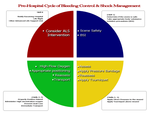
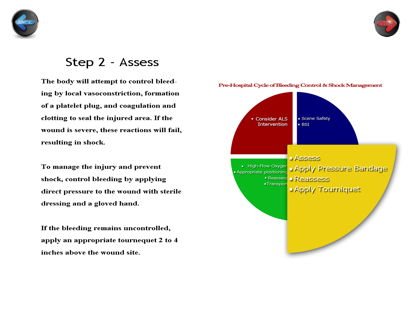
The activity for white space clarified my vision of the course appearance. This portion of the assignment solidifies the main tenets of the activities, so I decided that keeping it simple and clean reinforces what my students are learning in the course’s printed materials and face to face skills practice. I allowed a generous amount of white space around the text to help the readers access the more “personally relevant” information (p. 274), and I placed the navigation buttons on opposing sides of the page to create a symmetrical appearance and help to balance the page (p. 275). Initially, I kept the circle that I had developed previously intact. My reviewer daughter suggested that I somehow emphasize the step I am on in the diagram, so I enlarged the yellow quadrant and agreed with her opinion. I will keep her change. I might also change the “Step 2 – Assessment” position to the center to further balance the white space.
Before:
 Click here for full size
After:
 Click here for full size

Leave a comment