Archive for Standard 2: Development
December 16, 2012 at 4:20 PM · Filed under 2.2 Audiovisual Technologies, 2.3 Computer-Based Technologies, 2.4 Integrated Technologies, 3.1 Media Utilization, EDTECH597
I did it. This 50 year old mom and teacher created multiple productivity and entertainment apps for my mobile device, despite my novice status among app users and Android O/S. Even more impressive is the functionality of the apps created by my classmates and colleagues. From creating something sweet to seeing how the sugar impacts our cells, I stand in respect and awe of what can be developed and designed with a series of well placed pieces – or “blocks.”
I clearly remember 1972. I am 10 years old, sitting in my fourth grade classroom listening to my much-loved teacher talking us through time – taking us on a journey of what then seemed to be fantasy. He spoke of when we were “grown-ups” that we would be able to see each other on TV while talking on our telephone. He said that we would be able to travel without going anywhere. The man was a visionary. Today, the phone talks to me! I can visit the sights of Singapore and hold a life-like Koi pond in the palm of my hand! I have the pleasure to not only see his description held true, but I have also been bestowed the honor and responsibility for pushing the technology forward!
I don’t know how much further I will grow in the app development. This course took me out of my comfort zone and challenged me to rise above technical glitches and create something of benefit. But understanding how the technology works gives me impetus to take the students in my classroom on a visionary journey of what can be…in their future.

Permalink
November 27, 2012 at 11:24 PM · Filed under 1.1 Instructional Systems Design, 1.2 Message Design, 2.3 Computer-Based Technologies, 2.4 Integrated Technologies, 3.1 Media Utilization, 4.1 Project Management, 5.1 Problem Analysis, EDTECH597
This app design has been an intriguing challenge that fits right in to my life of predicaments and situations. I switched smart phone platforms for this course and have struggled with something akin to regret these past few months. An accomplished iOS user, I feel clumsy and frustrated with the Android, but I persist in my overcoming this obstacle. Last week I determined to get my apps organized into folders. I was successful, but in doing so, I inadvertently changed some setting within my Android that has prevented me from connecting (blocks editor does not see my phone).
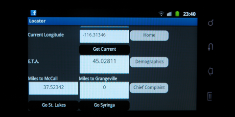
I plan for my app to be used by EMT’s on the ambulance or on scene. They will enter patient information that can be sent via SMS to our local ER prior to our arrival. We have to be cautious about providing a patient’s name over our radio communications, but there are several “hot spots” during our transport that an SMS message can be sent prior to our arrival (we have a minimum 45 minute transport). I designed the app so that the user will interact via text box entries, check boxes, gps positioning. and SMS messaging. The environment has varied lighting, so I avoided the use of color, choosing a neutral dark gray and white for the primary screens.
I like being able to drag and drop functions in the Component Designer. It gives me an opportunity to play with the layout. The file size constraint is a potential setback. I am worried that as my app continues to grow, the size might get too big, so I have been resizing the photos in Photoshop to stay within the 5MB limit. I have frequent problems launching the blocks editor and am wondering why at this late date it is beginning to give me problems.
Permalink
November 26, 2012 at 7:54 AM · Filed under 1.1 Instructional Systems Design, 1.2 Message Design, 1.3 Instructional Strategies, 2.3 Computer-Based Technologies, EDTECH506
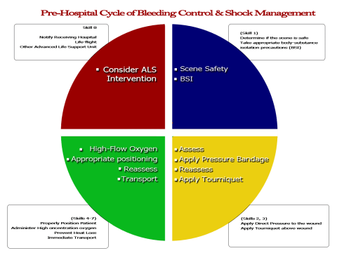
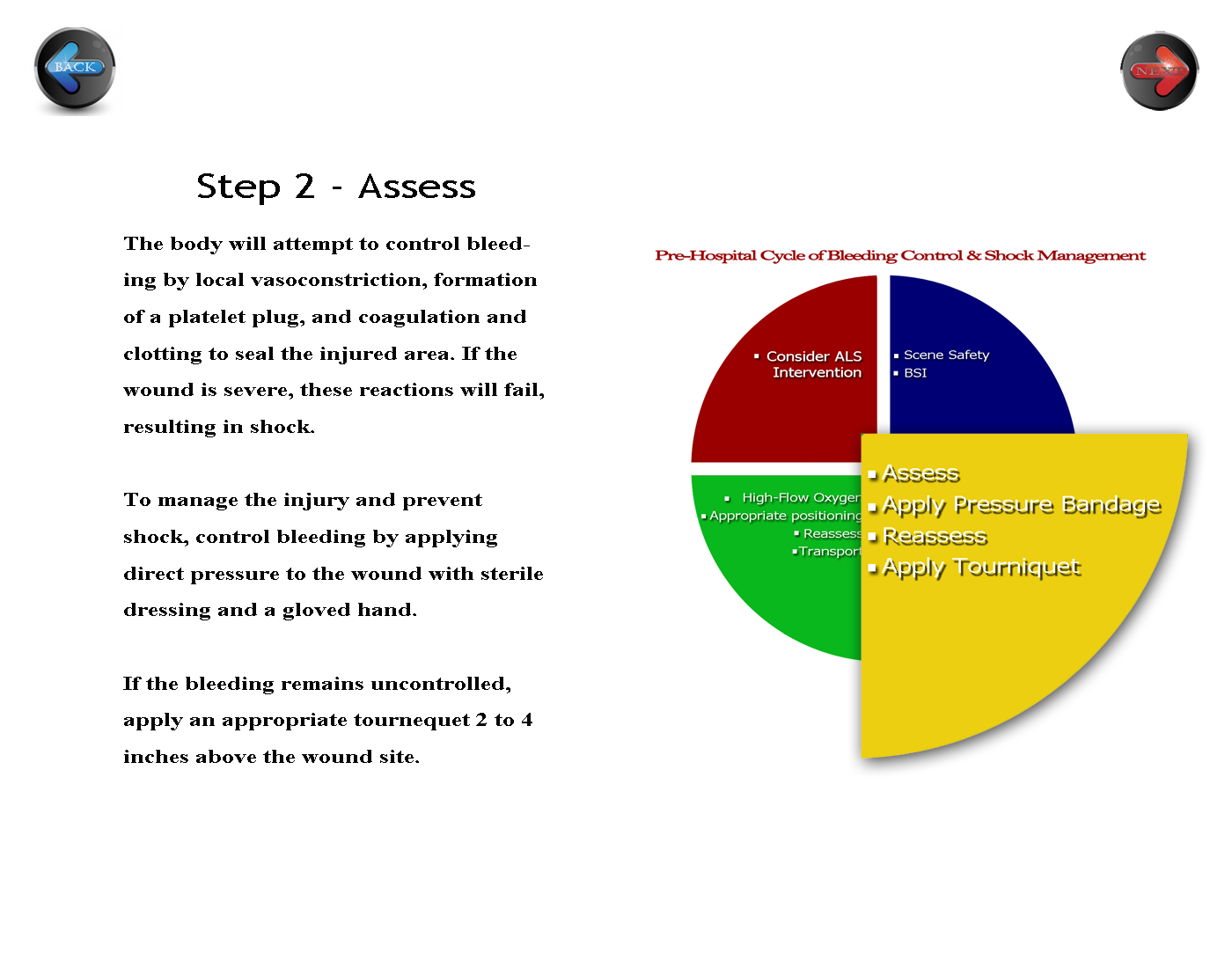
The activity for white space clarified my vision of the course appearance. This portion of the assignment solidifies the main tenets of the activities, so I decided that keeping it simple and clean reinforces what my students are learning in the course’s printed materials and face to face skills practice. I allowed a generous amount of white space around the text to help the readers access the more “personally relevant” information (p. 274), and I placed the navigation buttons on opposing sides of the page to create a symmetrical appearance and help to balance the page (p. 275). Initially, I kept the circle that I had developed previously intact. My reviewer daughter suggested that I somehow emphasize the step I am on in the diagram, so I enlarged the yellow quadrant and agreed with her opinion. I will keep her change. I might also change the “Step 2 – Assessment” position to the center to further balance the white space.
Before:
 Click here for full size
After:
 Click here for full size
Permalink
November 26, 2012 at 7:50 AM · Filed under 1.1 Instructional Systems Design, 2.3 Computer-Based Technologies, EDTECH506
After reading about the relationships between organization and learning, a looked over print and web learning material for both good and poor examples of Lohr’s principle of organization. The thought process behind developing a learning site surprised me. I realized that in fact, most of the process goes on in the head and on the design pad. This chart represents the Fick Principle or the metabolism of oxygen, and provides a clear understanding of the interaction between what we term as the ABCs – Airway, Breathing, and Circulation. We need oxygen to live at the most basic cellular level. Oxygen is our primary fuel, and our bloodstream is the transport for that fuel to become metabolized. I chose the shapes because they represent molecules of oxygen or carbon dioxide. The red arrows symbolize the blood stream that transports the oxygen. I used a circular model to emphasize the circulatory nature of the cycle with the inhalation situated at the top and moving in a clockwise pattern as common to western culture and the thick arrows suggest a strong relationship between each action (p 128) – if any part of this chain is broken, the cycle becomes incomplete and the human body systems begin an attempt to compensate for the loss. This compensation is known as “shock.” I placed the beginning of the cycle at the top-most position, knowing that my learners are used to a left-right reading order (p. 135). But I will change it to add a slightly larger circle to more clearly define where to begin the cycle.

Lohr, L. (2008). Creating graphics for learning and performance: lessons in visual literacy (2 ed.). Upper Saddle River, NJ: Merrill. Retrieved 2012
Permalink
November 26, 2012 at 7:44 AM · Filed under 1.1 Instructional Systems Design, 1.2 Message Design, 1.3 Instructional Strategies, 2.3 Computer-Based Technologies, 2.4 Integrated Technologies, EDTECH506
 My adult learners are often fatigued when they come to my evening classes. Despite thier lack of energy, I need for them to be alert. To provide an energy boost and give them some mental stimulus, I choose to use patriotic red, white, and blue color scheme (p. 265). Not only does each color stimulate their senses, each color represents an aspect of pre-hospital care that few see. Red represents blood, blue represents courage, and white represents cleanliness or purity. I chose hues with contrasting values – the bright (high intensity) red and the deeper (lower intensity) blue. My assignment is a cardiac label that will be used to indicate blood flow, identify electrical impulse areas, and identify structures of the heart. For a representation of reality (p.254), I chose to use blue font to represent the unoxygenated blood returning from the peripheral systems. I then chose to use red to indicate oxygenated blood flow.
Lohr, L. (2008). Creating graphics for learning and performance: lessons in visual literacy (2 ed.). Upper Saddle River, NJ: Merrill. Retrieved 2012
Permalink
November 26, 2012 at 7:13 AM · Filed under 1.2 Message Design, 1.4 Learner Characteristics, 2.3 Computer-Based Technologies, 3.1 Media Utilization, 4.3 Delivery System Management, 4.4 Information Management, EDTECH506
There are many factors to providing critical prehospital care. EMTs have to know how to determine if a patient is in immediate need of advanced care. The students taking this course will refer to this condensed chart which follows Lohr’s three C’s. There is a lot to remember in this section, so I concentrated a lot of information in one spot. In doing so, I also designed it to be concise and concrete with the white text dominating the field. I initially had the blue text fields extending out to the edge of the page, but decided to increase the white ground a bit to balance the high contrast of the blue and red after my reviewer complained that it “hurt his eyes.” I decided the problem was one in which the figure and ground competed (p. 102). When I reduced the width of the blue, I found that the text was enhanced by the white space around the blue text box.
I analyzed the figure to see if I had unintentionally created a visual conflict. Originally, I had. The blue textboxes made the graphic look like a US Navy add with the blue and white “stripes” creating a 1+1=3 phenomenon (p. 100). My reviewer’s complaint told me that the figure and ground were causing visual conflict. The revision is much better – allowing the learner to “focus easily and quickly on [the] key message.” (p. 105).
Overall, I am pleased with this part of my project. I used the same colors as prior projects to begin developing a color theme of red, white, and blue to match that of our ambulance service. It will work because it is easy to read and put into a logical format. These are not cardinal elements, so leaving them unnumbered helps to reduce the tendency to rank the elements.

References
Lohr, L. (2008). Creating graphics for learning and performance: Lessons in visual literacy. (Second.) Upper Saddle River, NJ: Pearson Education, Inc.
Permalink
November 11, 2012 at 11:47 PM · Filed under 1.1 Instructional Systems Design, 2.2 Audiovisual Technologies, 2.3 Computer-Based Technologies, 2.4 Integrated Technologies, 5.1 Problem Analysis, EDTECH597
I have finally made an app that I will use for more than a cool curiosity, but not before life got in the way. This weekend was spent up north helping my husband recover from an unexpected flood caused by a burst water gasket/hosing in the RV. We found an apartment and got him relocated, but the hours spent helping him has really put a divet into my coursework for the three EDTECH classes I am taking. Nevertheless, I was able to spend about 7.5 hours on this project, and I am pleased with the results. As an EMT instructor, I found the possibilities for an EMS quiz app enticing. Users could refresh their knowledge and prepare for certification exams. It took some time to find Creative Commons pictures that would be applicable to this app. Initially, I would like to put the “correct” answers in a number of different ways, since the app is prone to unforgiving syntax errors. To counter that problem, I added the correct answer to the “incorrect” message, so that if a student was close, or needed an uppercase or space, he or she would know the response was actually correct.
Permalink
November 11, 2012 at 10:00 PM · Filed under 2.3 Computer-Based Technologies, 2.4 Integrated Technologies, 3.1 Media Utilization, 4.1 Project Management, 5.1 Problem Analysis, EDTECH597
 If you have ever experienced a moment of consternation upon exiting a mall or movie theater, the “Find My Car” app will put your fears to rest. Developing the app was an experience akin to finding your car in a packed lot. The design was pretty straightforward, but my desire to increase the font size caused the app to crash and not function well. App crashes were not the only problem, my blocks editor refused to load time after time. After a Java rollback, I was able to get the program to stabilize. I feel challenged to push this app, but I don’t know where! I added images to the buttons, and was finally successful in adding an Icon for the App Screen. Because I won’t be driving to my car, I used the walking option with Google Maps. Nevertheless, trial after trial I keep getting the same font argument error. Status update when/if a new functional version gets put out.
Update: The font argument was not about the font, but the incorrect block in the blocks editor. Third time was the charm! This tool is functional, but rather slow on my Android and takes a long time to load.
Permalink
November 11, 2012 at 2:11 PM · Filed under 1.1 Instructional Systems Design, 1.2 Message Design, 1.3 Instructional Strategies, 2.1 Print Technologies, 2.2 Audiovisual Technologies, 2.3 Computer-Based Technologies, 2.4 Integrated Technologies, 3.1 Media Utilization, 5.1 Problem Analysis, EDTECH506
There are many factors to providing critical prehospital care. EMTs must gain the skills necessary to quickly determine if a patient is in immediate need of advanced care. I wanted the design of the critical care page to be comprehensive, yet clean. As students enter their practical skills, they need to easily remember the information presented. There is a lot to remember in this section, so the design demands that a lot of information is concentrated in each section. I enhanced the text with contrasting colors for cohesiveness, but the sheer volume of text still needed something more to make the steps more concrete. Because a picture is worth a thousand words, I am seeking representative images to further solidify the different steps.
References
Lohr, L. (2008). Creating graphics for learning and performance: Lessons in visual literacy. (Second.) Upper Saddle River, NJ: Pearson Education, Inc.

There is a lot to remember in this section, so I concentrated a lot of information in one spot. In doing so, I also designed it to be concise and concrete with the white text dominating the field. The generous white space offsets the high contrast of the blue and red.
Permalink
October 22, 2012 at 12:44 AM · Filed under 1.3 Instructional Strategies, 2.1 Print Technologies, 2.3 Computer-Based Technologies, 2.4 Integrated Technologies, 3.1 Media Utilization, EDTECH506
CARP design elements are used to better communicate a lesson or message through visual representation. Contrast. Alignment. Repetition. Proximity. Each of these elements impacts learning, and a good design will improve the course content. I chose grey-scale for my design, planning a contrast punch with black and white text and graphics. I chose the organized feel of rectangle shapes and symmetrical rows and columns they create, while using repetition to lighten the tense lines in the image. Each row a different color, but the proximity of clone like text boxes reveals the concepts therein are connected. In the end, I’m pleased with that decision feeling like I have met the first course goal – “to apply principles of visual literacy o the design of instructional messages.”
Permalink


