One of the first lessons I learned in elementary school was the use of shapes in art. Like many of my classmates, I happily drew triangles, circles, squares, and rectangles intermingled with lines of all lengths and thicknesses to represent happy families, houses, flowers, trees, and the bright shining sun. As time passed, I used ovals and more lines to practice the alphabet and numbers 0-9.
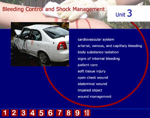
Shapes and lines continue to play an important part in my hobbies of photography and drawing. My eyes seek out and find shapes and patterns everywhere I look. This chapter has been by far a favorite as I gain new insight to some of the visual characteristics of shapes and how they communicate unity, emotions, or organization. I was intrigued by the examples Lohr sets forth in Figures 10-2 through 10-6 (pp. 251-255) and noted that I am usually drawn to those layouts that depict unity and those that separate and define. Therefore it was no surprise that I chose to use those elements in my own layout for my unit. I chose to use simple rectangles to organize the information on a standard computer display. Other units can be quickly accessed on the lower ribbon links. I like the way rectangles highlight and organize the information with clean lines. My use of color parallels the colors we use on our local EMS logo and ambulance. When my daughter pointed out that my page looked a little bit “cluttered” I added the broken circle in an attempt to unify the page elements and a solid line of a different color to separate and define the other units. I am pleased with the results, but knowing my penchant for revision, left the layers intact for future editing.

Leave a comment