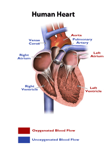
 My adult learners are often fatigued when they come to my evening classes. Despite thier lack of energy, I need for them to be alert. To provide an energy boost and give them some mental stimulus, I choose to use patriotic red, white, and blue color scheme (p. 265). Not only does each color stimulate their senses, each color represents an aspect of pre-hospital care that few see. Red represents blood, blue represents courage, and white represents cleanliness or purity. I chose hues with contrasting values – the bright (high intensity) red and the deeper (lower intensity) blue. My assignment is a cardiac label that will be used to indicate blood flow, identify electrical impulse areas, and identify structures of the heart. For a representation of reality (p.254), I chose to use blue font to represent the unoxygenated blood returning from the peripheral systems. I then chose to use red to indicate oxygenated blood flow.
Lohr, L. (2008). Creating graphics for learning and performance: lessons in visual literacy (2 ed.). Upper Saddle River, NJ: Merrill. Retrieved 2012
EDTECH506: Picture This
November 26, 2012 at 7:44 AM · Filed under 1.1 Instructional Systems Design, 1.2 Message Design, 1.3 Instructional Strategies, 2.3 Computer-Based Technologies, 2.4 Integrated Technologies, EDTECH506
Leave a comment