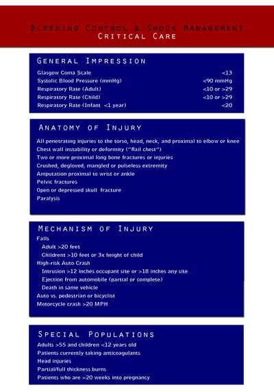
There are many factors to providing critical prehospital care. EMTs have to know how to determine if a patient is in immediate need of advanced care. The students taking this course will refer to this condensed chart which follows Lohr’s three C’s. There is a lot to remember in this section, so I concentrated a lot of information in one spot. In doing so, I also designed it to be concise and concrete with the white text dominating the field. I initially had the blue text fields extending out to the edge of the page, but decided to increase the white ground a bit to balance the high contrast of the blue and red after my reviewer complained that it “hurt his eyes.” I decided the problem was one in which the figure and ground competed (p. 102). When I reduced the width of the blue, I found that the text was enhanced by the white space around the blue text box.
I analyzed the figure to see if I had unintentionally created a visual conflict. Originally, I had. The blue textboxes made the graphic look like a US Navy add with the blue and white “stripes” creating a 1+1=3 phenomenon (p. 100). My reviewer’s complaint told me that the figure and ground were causing visual conflict. The revision is much better – allowing the learner to “focus easily and quickly on [the] key message.” (p. 105).
Overall, I am pleased with this part of my project. I used the same colors as prior projects to begin developing a color theme of red, white, and blue to match that of our ambulance service. It will work because it is easy to read and put into a logical format. These are not cardinal elements, so leaving them unnumbered helps to reduce the tendency to rank the elements.

References
Lohr, L. (2008). Creating graphics for learning and performance: Lessons in visual literacy. (Second.) Upper Saddle River, NJ: Pearson Education, Inc.
Leave a comment